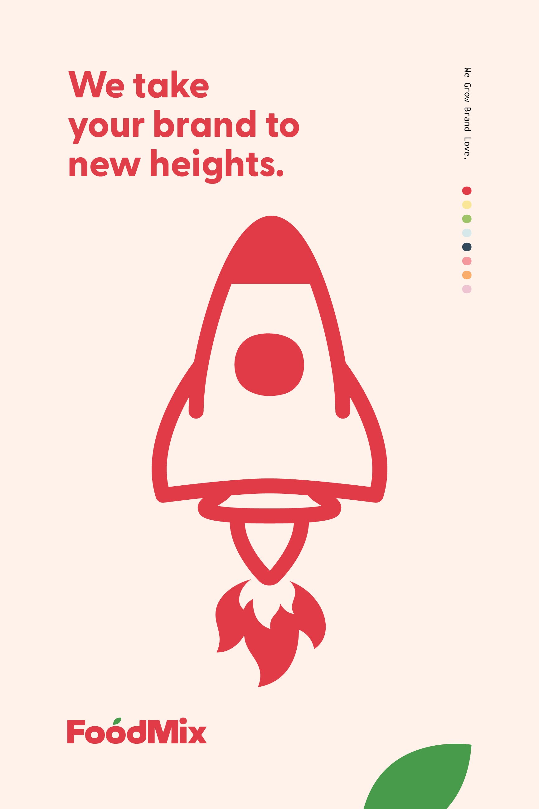
FoodMix Marketing
We Grow
Brand Love.

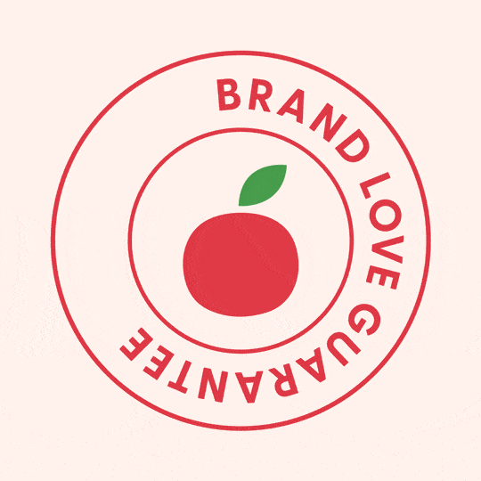
This work aimed to refresh the FoodMix brand identity to clearly state their promise to “Grow Brand Love” for their clients. We built a romantic backstory for our previously unexplained tomato icon to embody their pledge fully. Through research, we discovered that the tomato was once known as the Pomme d’Amour – a powerful aphrodisiac used to win the object of one’s affection. This became our jumping-off point for a complete brand redesign that leaned heavily into the romantic whimsy that sprung from a tomato with the power to Grow Brand Love.
A brand refresh built
around a tomato.
The new logo is a modern twist on the original. It is reminiscent of food items with its round but imperfect edges and the shape of the “o” in FoodMix. Taller letters give a more friendly, quirky, and inviting feeling. The tomato with its leaf is used as a shape and icon for other design elements.


Identity Design System
Each element within the system carries the shape of the tomato. The tomato is not a perfect circle but round.

Icons
The illustrations use the shape of our tomato in their curves and turns. The icons reflect our passion for disciplined design and strategy that ladder up to our true purpose: growing Brand Love for our clients to their customer base.


Refreshed Color Palette
The three lead colors are tomato red, leaf green and a subtle color to ground the first two. The supporting colors reference each of the departments within the agency in order of how the departments work together.