Our Next Energy
Brand Strategy
& Design
Brand Identity for a EV battery start-up
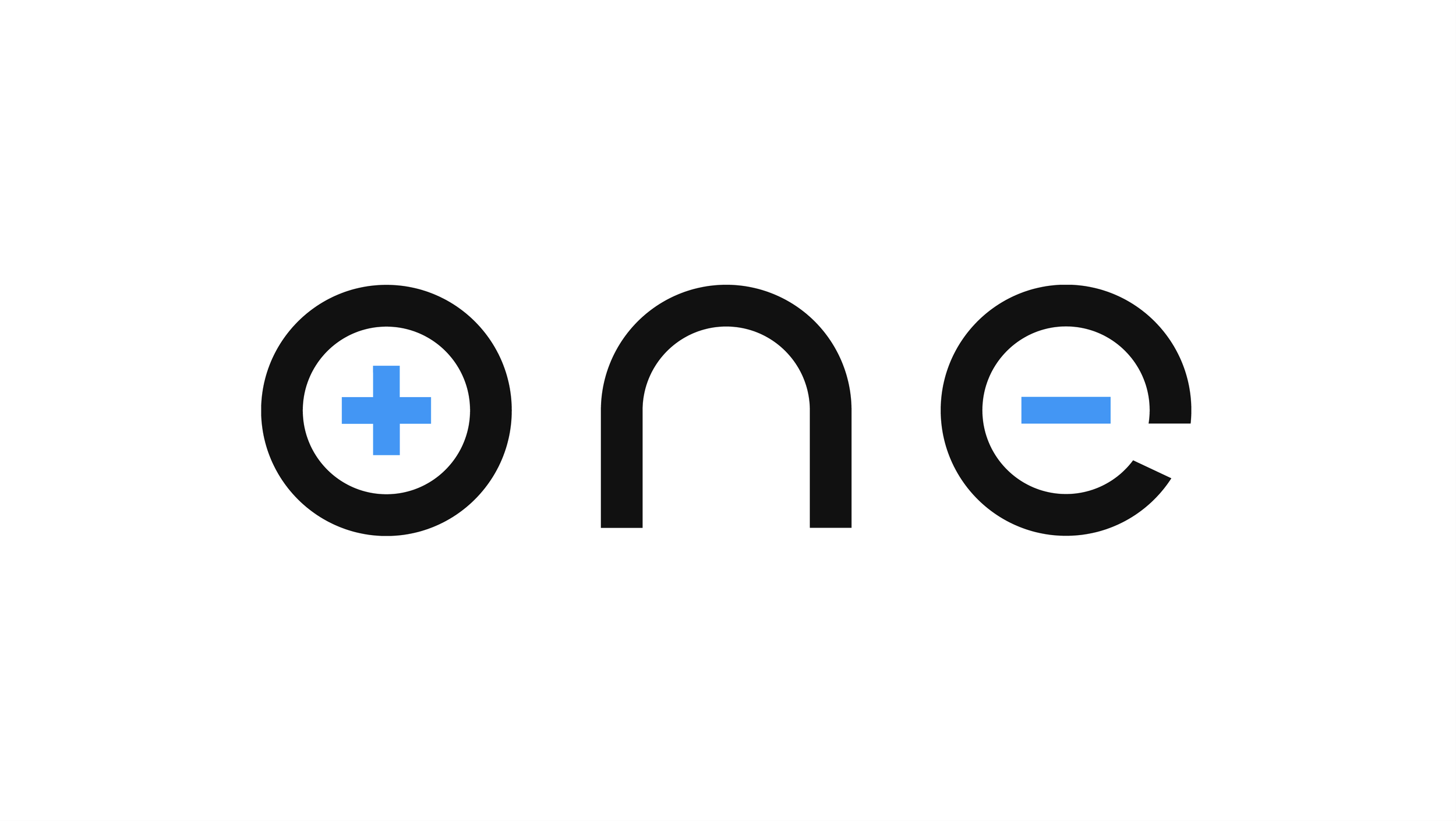
The ONE logo was created before I joined the company. While there was an initial attempt at building a brand, it remained incomplete.

Integrity, creativity, and empathy shape the way we work. These aren't just words—they’re the foundation of everything we build. We believe in doing great work, building real relationships, and making it easy for you to get the results you’re looking for.

The brand identity is rooted in how power moves and the color
Motion Principle: Rise
The rising vertical movement is uplifting and positive.
In addition to its dynamic feel, it also works across all formats— on both 9:16 and 1:1 aspect ratios, and it can be easily adapted to more horizontal formats such as 16:9.
Motion on Text
The X-height is used as the base measurement for the distance traveled vertically on the screen. It brings consistency to the movement across different applications and maintains the same level of energy no matter the type size.
Motion on Graphics
Graphics expand in height from the base, in a rising motion to its final form.

Specifications
The X-height is the base measurement for the distance traveled vertically.

Specifications
Graphics expand from the base, in a rising motion to its final form.
Credits
Company
ONE (Our Next Energy)
Executive Creative Director
Andrew Nethery
Creative Leads
Michele Underwood (art and design), Madison Kahn (copy)
Design
Louis
Director of Creative Production
Marc Bail